CSS ELEMENTS POSITION
Introduction
There are many ways to position elements with CSS. Just by adjusting margin values, for example, we can move an element on the website.
The browser interprets the HTML flow from left to right and from top to bottom. Therefore, it is very important to understand first which HTML elements follow an inline flow and which ones are positioned as a block.
Inline Elements
This kind of elements get positioned along a line like below:
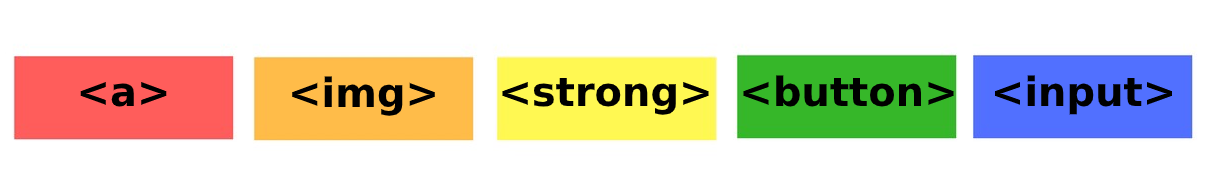
Some Inline Elements examples are: span, a, img, strong, em, button, input, label, select, textarea, etc.
Block Elements
This kind of elements always start on a new line:
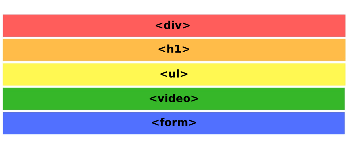
Some Block Elements examples are: div, header, nav, section, article, aside, main, footer, audio, video, figure, figcaption, form, table, ul, ol, li, p, hr, headings (h1-h6), etc.
Positioning properties
In order to modify the HTML flow, we can use the following CSS properties:
| Position | static, relative, absolute, fixed and sticky |
|---|---|
| Display | inline, block, inline-block |
| Z-Index | plays with overlapping |
| Float | moves elements to the left or to the right |
| Clear | avoids that floating elements crash |
| Flex-box | aligns elements horizontal or vertically (1 dimension) |
| Grid | aligns elements horizontal or vertically (2 dimension) |
Position
It allows to modify the flow of the HTML elements, taking the X and Y axis as reference.
Static
It is the default value of an element.
Relative
It acts exactly like the static position if we don't specify any top, right, bottom and left values.
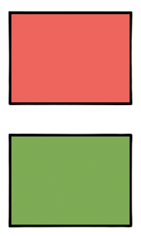
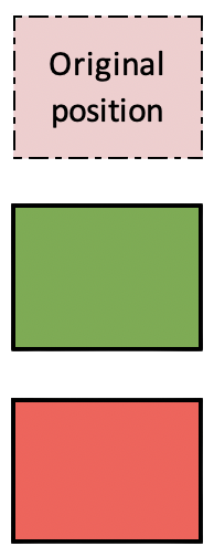
Let's apply a relative position to the red box.
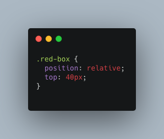
Once we use relative in combination with top, the red box will move down while the green box will stay in the same position. Despite the red box has a relative position, the original position won't be replaced.
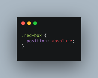
Absolute
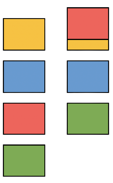
An element with this property will ignore the whole HTML flow and it will be also ignored by the rest of the elements, except if it is positioned within a parent container and this has a relative position.
In this case, if we set the red box in a relative position, the rest of the elements will also move up, breaking the flow.
Fixed
This position keeps an element completely fixed and it won't move although we scroll down. It is very useful to create navigation bars, like the following example.
Sticky
Sticky positioning combines relative and fixed. The element is treated as relative positioned but when it crosses another element, it will be treated as fixed positioned.
If you would like to see all position examples, don't miss out the next video:
Display
Display the elements horizontal or vertically. It has the following 3 properties:
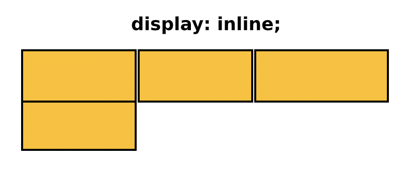
Inline
It positions block elements inline but it won't respect the width and height set.
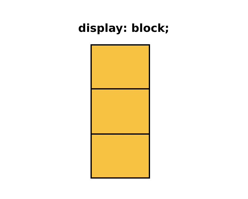
Block
It positions inline elements as blocks.
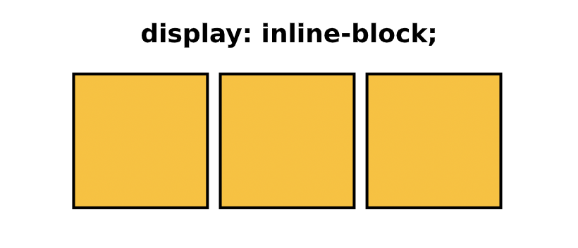
Inline-Block
It works the same as inline but it respects the width and height we had set. Buttons and images have inline-block as their default display value.
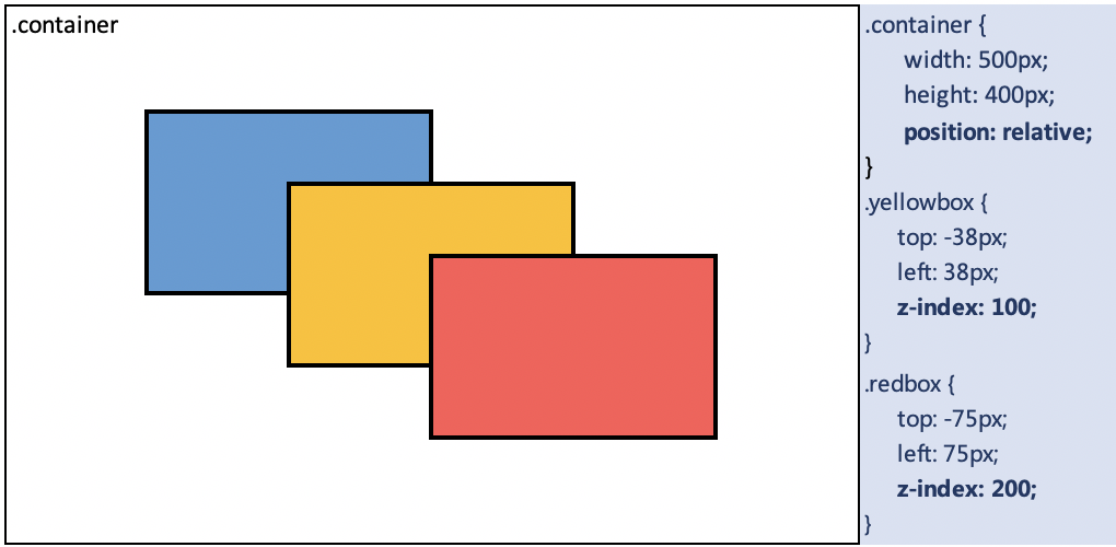
Z-Index
It works taking the Z axis (depth) into consideration. This property allows to play with overlapping. The element with the highest value will be displayed above the other elements.
Z-Index doesn't work with static elements. All elements need to be positioned.
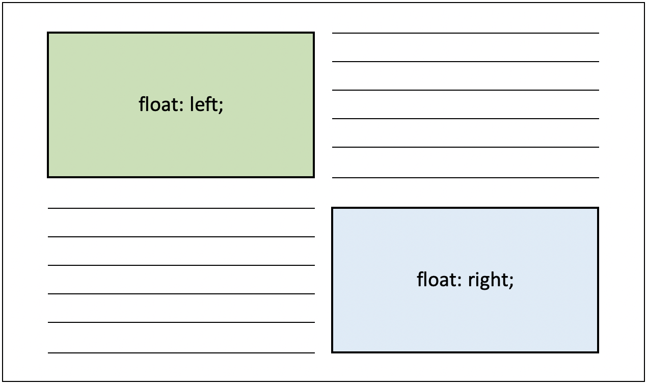
Float
This property moves elements to the left or to the right. It only works with elements positioned as static or relative that also have a width declared.
Clear
This property is used together with float, and it controlls float's behaviour. It avoids that floating elements collapse.
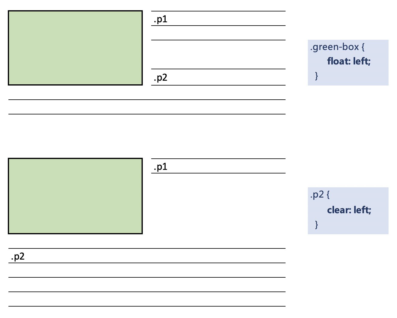
The clear values are left, right, both and none.
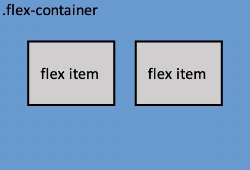
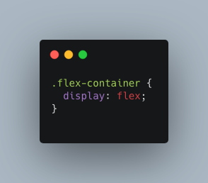
Flex-Box
The Flexible Box Layout can position multiple elements within a container horizontal or vertically. By default, this property positions the elements inline.
Do not mistake it with the display positioning.
This layout has many different properties, which can be applied to the flex container but also to the flex items.
| Flex container properties | Flex items properties |
|---|---|
| justify-content | flex-grow |
| align-items | flex-shrink |
| flex-wrap | flex-basis |
| flex-direction | flex |
| align-content | order |
| flex-flow | align-self |
If you would like to learn how to combine the flex properties, don't miss out the next video:
If you would like to practice the flex properties, check Flexbox Froggy or Flexbox Zombies.
Grid
The Grid is similar to the Flexible Box Layout. We can position multiple elements within a container specifying the number of columns and rows. By default, this property positions the elements as a column. There is a new unit called fraction (fr) that we can use with a grid.
In order to start, we need to create a grid container that contains other elements (rows and columns) To do so, we can use the following properties:
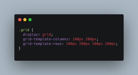
The grid-template-colums or rows define the number of columns and rows we want and their size. In this case, 1 column of 100px, 1 column of 200px, 1 row of 100px 1 row of 200px 1 row of 100px and 1 row of 200px.
If we want to simplify the code, we can simply use repeat or a grid-template
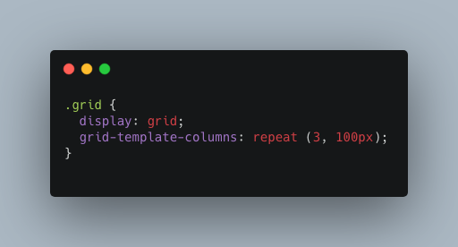
In this example, repeat defines 3 columns of 100px each.
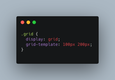
The grid-template combines the row and columns together (in this order) Therefore, we will create a grid with 1 row of 100px and 1 column of 200px.
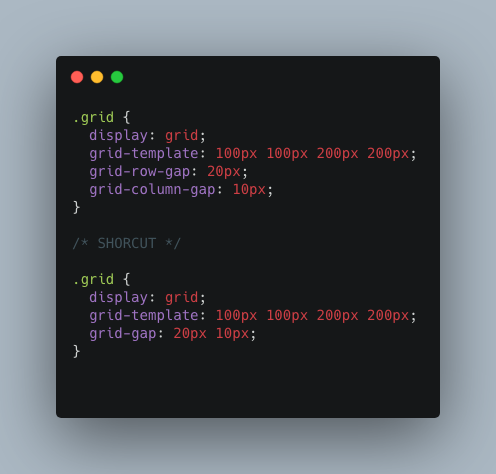
What about adding some space between rows and columns? Let's use the grid-row-gap, grid-column-gap or the combination of both (grid-gap)
We can also expand rows and columns in two different ways:
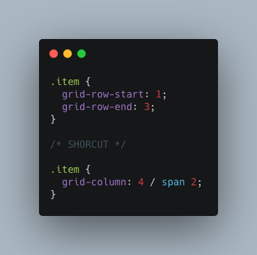
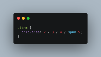
And, as usual, we can also simplify the above code with the grid-area specifying the row start / column start / row end / column end:
Some other properties that we can declare within the grid container or the grid items are:
| Grid container properties | Grid items properties |
|---|---|
| justify-items | justify-self |
| align-items | align-self |
| justify-content | |
| align-content | |
| grid-auto-rows & grid-auto-columns | |
| grid-auto-flow |
Watch out the next video to learn about the grid properties:
If you would like to practice the grid properties, check Grid Garden.